As a cartographer, Stefan Freelan lives a pretty routine life, teaching computer skills such as Geographic Information Systems (GIS) and Global Positioning Systems (GPS) to students at Huxley College of the Environment in Bellingham.
But one day nearly a decade ago, a Canadian-born colleague came knocking at Freelan’s door.
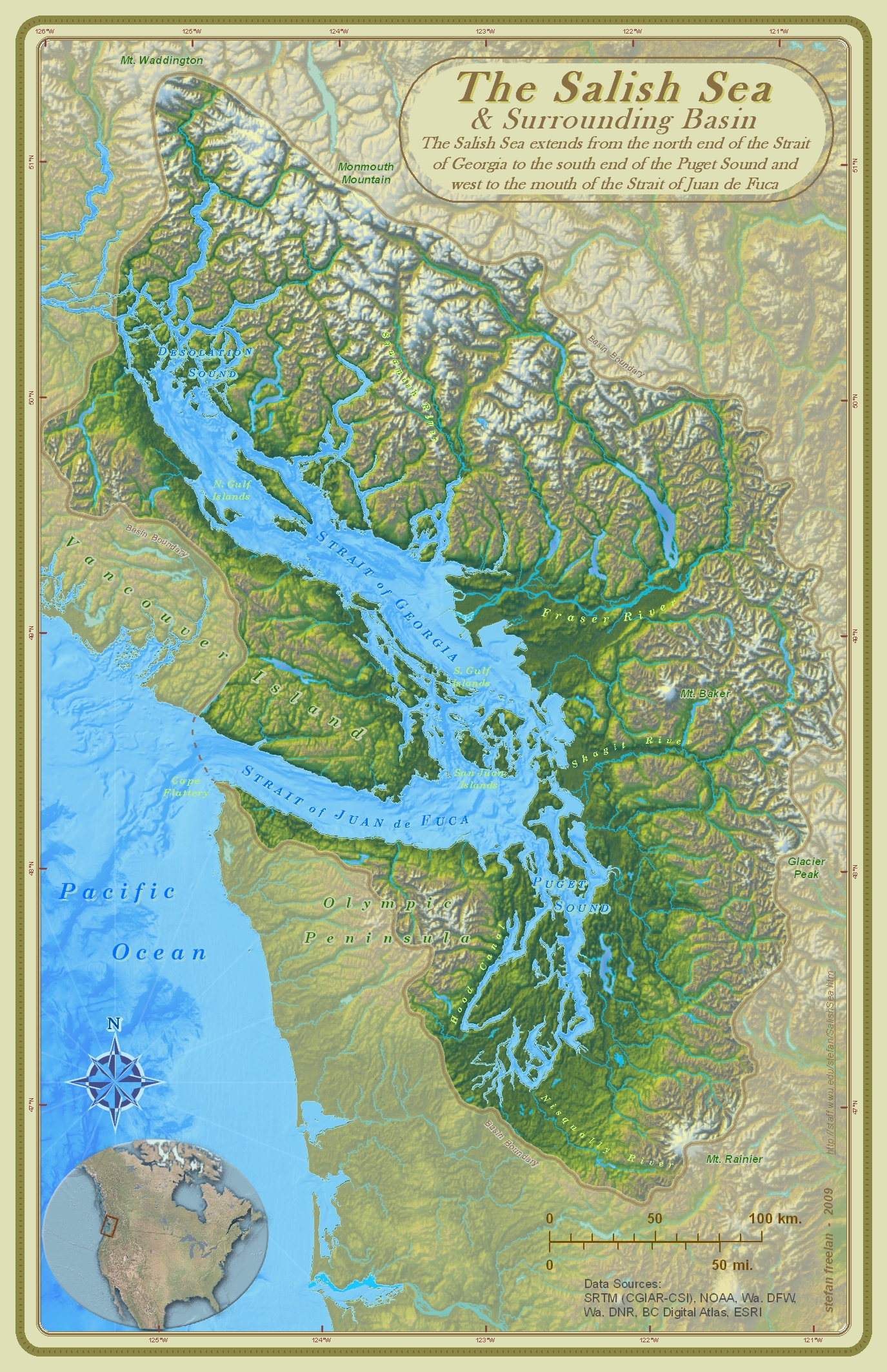
Bert Webber, a professor of Geography and Environmental Social Sciences at the time, was trying to spread the word about a newly-named body of water. He asked Freelan to help him by making a map of the Salish Sea.
“And specifically, he wanted a map that did not have a line right through the middle of his bioregion, i.e., the international border,” Freelan said.

The sea includes watersheds in western Washington and British Columbia, describing an ecosystem that encompasses territories in both the United States and Canada.
“My response was, ‘If you’re trying to get this name across, let’s treat this as a piece of propaganda,’” Freelan says. “Let’s try to make a beautiful map – something people want to put on their wall.”
So began an obsessive period resulting in Freelan’s most popular creation to date. In addition to making the map pretty, the two scientists agreed to keep it in the public domain. The only requirement is to let Freelan know if you intend to replicate the map.
Nearly ten years later, Freelan continues to receive several emails a month with requests to use the map.
“Teachers in elementary or high school or college, students who’ve got projects, government agencies, the Department of Ecology, First Nations who put it on their t-shirts a few years ago, whale-watching tours. It just goes on and on,” Freelan said.
What makes Freelan’s Salish Sea map special is not what it includes but what it leaves out.
To highlight natural aspects of the region, Freelan and Webber agreed to take off what are normally considered standard base map features: Roads, railroads, and cities. Rather than your average tan and blue Google Map, Freelan wanted to use a variety of blue, green and brown tones to convey elevation and environmental changes within the ecosystem.
It’s easy for many of us to think some parts of the sea are more important than others. But in creating something new, Freelan learned, for example, just how small the Puget Sound is, relative to the whole.
“When you look at the Salish Sea, Puget Sound has a fairly large impact politically,” Freelan said. “There were efforts at one time to call the whole thing the Puget Sound, and it’s not.”
Freelan says naming the sea is so important because it’s an umbrella term, not a replacement. Considering oneself a resident of the Salish Sea creates common identity between Americans and Canadians, Washingtonians and British Columbians.
And he doesn’t mind that this concept, which was promoted by scientists concerned about protecting the health of the ecosystem, has been co-opted as a marketing tool. He feels it’s a good sign, that he succeeded in creating propaganda with his map.
“It’s a pretty good brand,” he says of the Salish Sea. “It’s our brand.”
